


Description:
Emails became one of my favorite projects because they allowed me to practice being creative while staying true to the brand. For email inspiration, I subscribed to a number of companies and enjoyed sorting through my inbox every morning. I scrolled through emails from Pottery Barn, West Elm, Joss & Main, Cult Furniture, Rifle Paper Co, Nordstrom, and Anthropologie—to name a few.
Some of the design elements I noticed again and again included gifs, typography on lifestyle photography, CTAs housed in buttons, a patterned frame around photography, grid layouts, and the use of silo photography.
My Role:
Layout, Typography

A collection of my favorite inspiration emails.

For this email, I created a simple, branded gif to catch viewers’ attention. I drew inspiration from Nordstom’s holiday-themed gifs on their website. Together with my copy writer and another designer, we incorporated the illustrations on the furniture to maintain a playful vibe throughout.
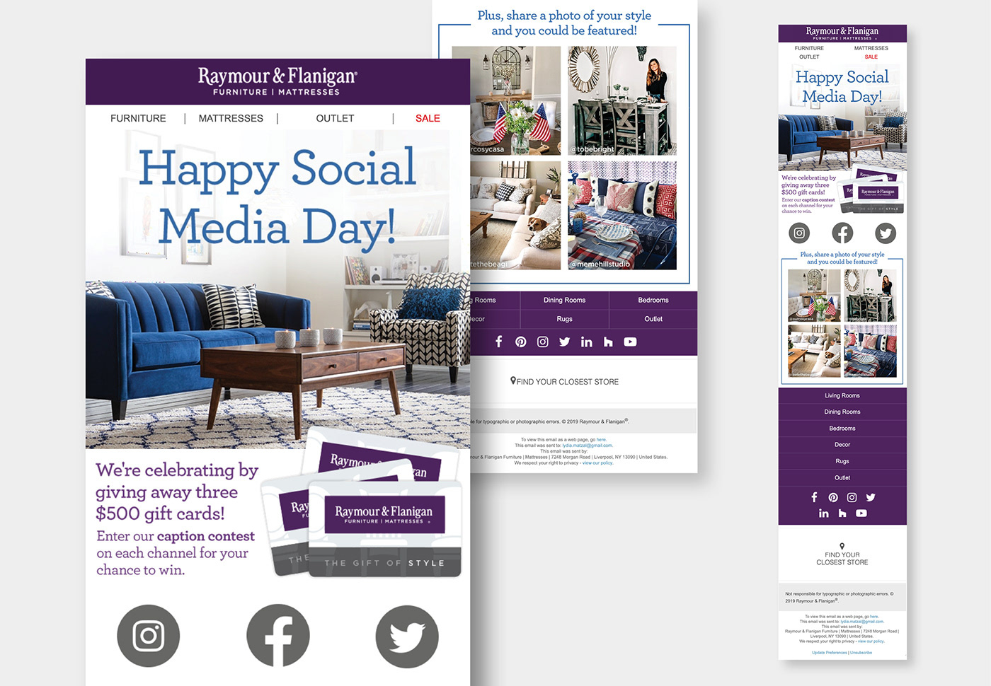
Left: Desktop • Right: Mobile

With two days to start and finish the email, I chose a stock pattern to save time. The approval process went smoothly except for a request to include a giveaway call out at the end. I brainstormed with a copywriter and came up with a holiday-themed CTA. This was one of the best performing emails in the first quarter of 2019.

As one of eight furniture style emails, I worked off a template, but selected the color and the pattern to coordinate with the look and feel of the furniture and accessories.

I loved finding a hero image that coordinated with Pinterest’s color scheme. In the body, I added callouts to each featured Pinterest board and collaborated with my copywriter to come up with concise phrases.
Unlike most emails, this one lacked clear creative direction. I created a couple drafts with what I had, but it was most helpful to gather everyone together and talk through the desired goal and new content.

When my creative leader asked if my copy writer and I could include product call-outs, I considered a bubble, but ended up choosing a faint star to house the additional copy. I submitted the email for final review and the director of marketing liked our direction.

I chose a stock star pattern that coordinated with the established mattress gallery color scheme. This saved time and also could be easily reformatted and used by other designers on future bedding emails.

This email went though a number of revisions in the final submission. Originally, my copy writer supplied me with two bullet points about each fabric, but a leader from the social team said that the copy felt too informative and not creative enough. Initially we were disappointed with the feedback, but we met and wrote fresh, conversational copy. It was a long process from start to finish, but we were pleased with our work at the end.

I chose a simple design, highlighting the products and delivery message. My team loved my use of white space and began using more silo photography like I had done.
Thank you


